
The main tool used for editing the digipak was Photoshop- the template we worked off of was a Photoshop file, and we simply saved a copy of it with our changes as we progressed. We used a few different techniques to create the digipak- we chose studio shots of each of us for the front cover, and opened them in their own documents. Then we trimmed out the background, and used Photoshop's various edge options to smooth out any mistakes. Then we graded each person and put them in. We created various other elements for the digipak, such as ripped paper for the front, a colourful swirling background, and even a whole new set of photos from an extra photoshoot we planned and carried out over a few days to get the inside cover images. We chose various fonts to match the style we wanted, and carried over some of these (along with certain colours and other design choices) to the website. We used Photoshop's layering and masking tools to keep each page of the album cover within its assigned box on the template.
 |
| Photoshop CS5 from the Adobe Master Collection suite of software- the template we were given for the digipak was a Photoshop .psd file, which we saved our own copy of. Any extra images we needed were edited in separate Photoshop files and then imported into the main one. |
Our Challenges
We came across a fair few challenges while putting together our digipak. One big challenge was the technical difficulties we came across- for some reason, Noa's computer started acting up midway through the process. We tried many different things to get it to stop slowing down, and start responding to key presses and requests to open files, even enlisting the help of the media technician and school IT department. However, we eventually decided to save time and just have Jack and Noa swap computers. As Jack was working inside a browser, he had a lot less problems with the computer, while Noa got to move to a computer without any issues. This was an efficient and effective way of nullifying what could have been a very drawn-out and destructive problem.
Another challenge we faced was how to include the title of the album in a way that didn't obstruct the focal image of the album cover, i.e. the band members, but still made the title very visible. We had planned to put it in the corner above the band members on our flat plan, but actually creating the album and seeing how it worked in real life made us realise we didn't have enough space. Thus, we decided on having the effect of a line of ripped paper at the top, with a smaller one below, and the band members in between. The top line of ripper paper provided a blank space for the title to be centralised and obvious, and the space between the paper retained focus on the band members contained within it. Plus, the paper adds to our DIY aesthetic. We thus adapted to the challenges and changing ideas that arose when we created the digipak.
My Contributions
My contributions to this product include doing some of the basic work when Noa wasn't available and it needed to be done, suggesting various ideas and collaborating on important decisions, having the idea on how to create the colourful swirly background we ended up using, bringing in my camera and a lot of props for the photoshoot for the inside cover (having the inside cover be an interesting spread of items over a table was also my idea back in the planning stages,) suggesting some of the primary colours for the dominant colour scheme across the digipak, and more.
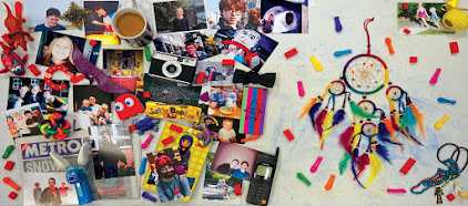
 |
| An example of one of the photos we took for the inside covers of the album. I brought in a lot of the photos, as well as the phone, colourful abstract ball, vintage camera, and the camera used to take the photo. Click to enlarge. |
Feedback and Changes
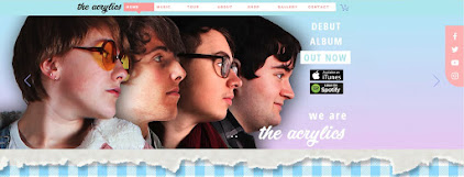
As we progressed through the creation of the digipak, we changed our ideas and received lots of feedback, which helped us reach a better final product. One of the first changes of this kind, and one of the biggest, was the move from having the band members go from large to small along the front like the flatplan, to instead having them in a straight line. We did it as the flatplan described at first, but realised something was wrong, yet couldn't think of any interesting alternatives. Audience members pointed out that, instead of what we currently had, just having the same images in a straight line would look quite good. Thus we proceeded with the ripped paper change mentioned above- we only had to create the paper effect, and didn't have to choose and edit different images of the band members. A side effect of these changes was to also make each band member more visible and recognisable through the move from full body longshots to midshots between the paper strips, especially the ones who were on the smaller end on the original design. This ended all our problems with the front cover in one fell swoop.
 |
| A segment of our album flatplan, showing the original descending size order, with Casey and Hugh as the two biggest. When we came to create this, multiple people confirmed our fears that the last two band members were too small. Click to enlarge. |
 |
| Our final album cover, showing everyone in a line. It is still interesting like the flatplan was, but the people are much more recognisable. Click to enlarge. |
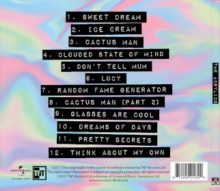
The final change we made was to make the legal information a lot clearer. We were told by our teachers that important images such as the record label logo as well as the barcode and similar weren't very obvious, and after a few test prints one of the staff noticed that they were outside of the acceptable template borders for the digipak too. Thus we simply responded by re-organising everything, putting a strip of legal information at a good size across the bottom of the back of the album cover, and having all the track names above it. This both eliminated the issue of not having all the legal information in a good format, as well as the sizing issues with the template that might have ruined the final printing.
 |
| The back of our album cover, showing both the clear track names in their black blocks, as well as the obvious strip of legal information, including record label logos and barcode, across the bottom. Black and white makes these elements stand out against the colourful background. Click to enlarge. |
Our Progress
Overall I think the digipak creation went well. While we could have decided on a better position for the band members before proceeding with the creation of the digipak, and while we could have saved even more time by swapping computers at the first sign of an issue rather than pushing onwards and seeing what happened for a short time, overall we responded to every change we thought we needed to make, and ended up with a good looking digipak which fulfilled everything we wanted and needed it to.
No comments:
Post a Comment